Brand Identity Redesign for VERITAS University.
VERITAS has been known during the past decades for leading the creative education industry in Costa Rica, nonetheless this perception has been associated mainly with art and design. Since the reopening of the Business Administration Program, there’s a necessity to create a brand concept that creates awareness about our program diversity and that creativity and design can be applied in every career. That's why the redesign of the whole visual system was important to reflect this spirit.
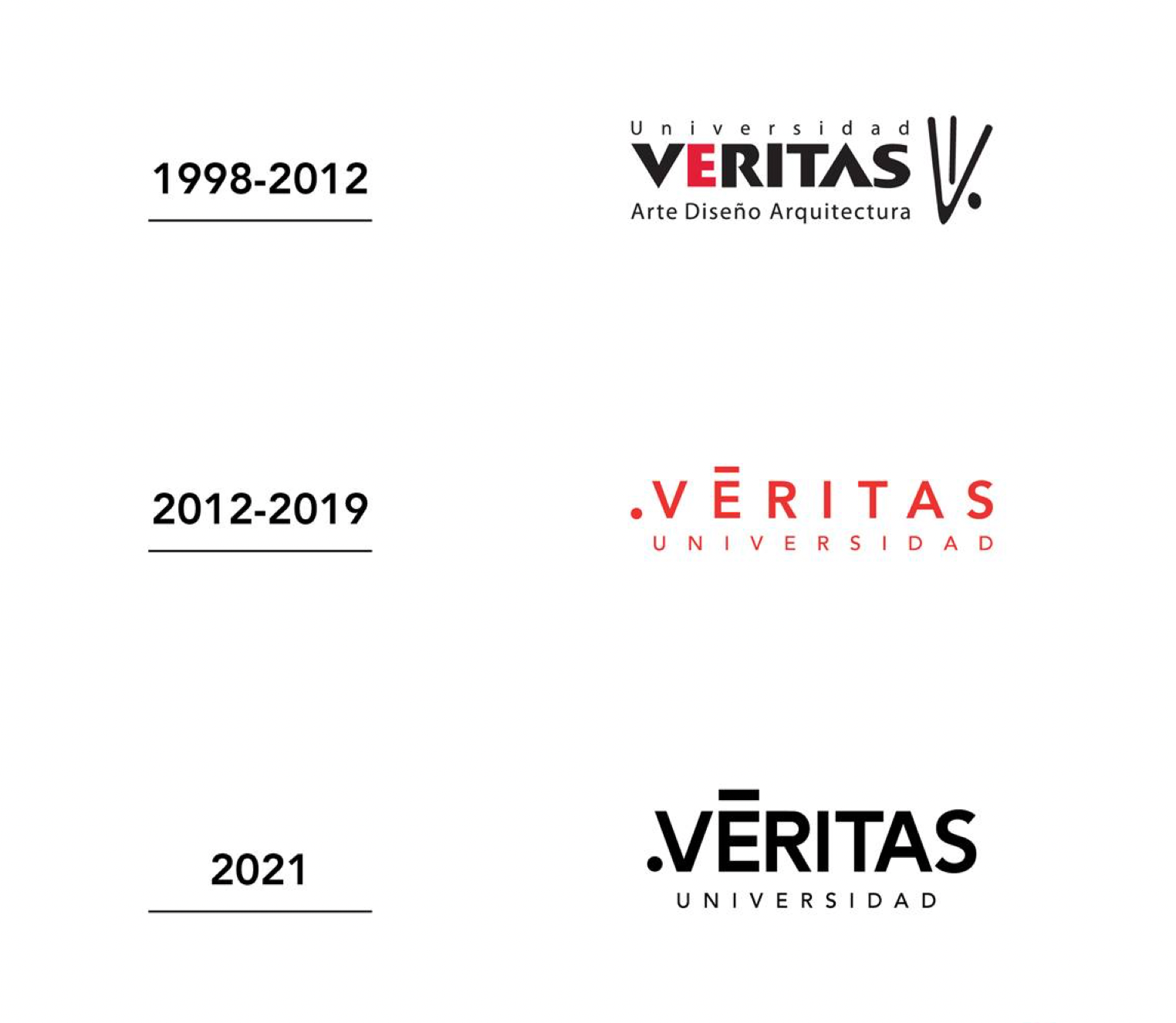
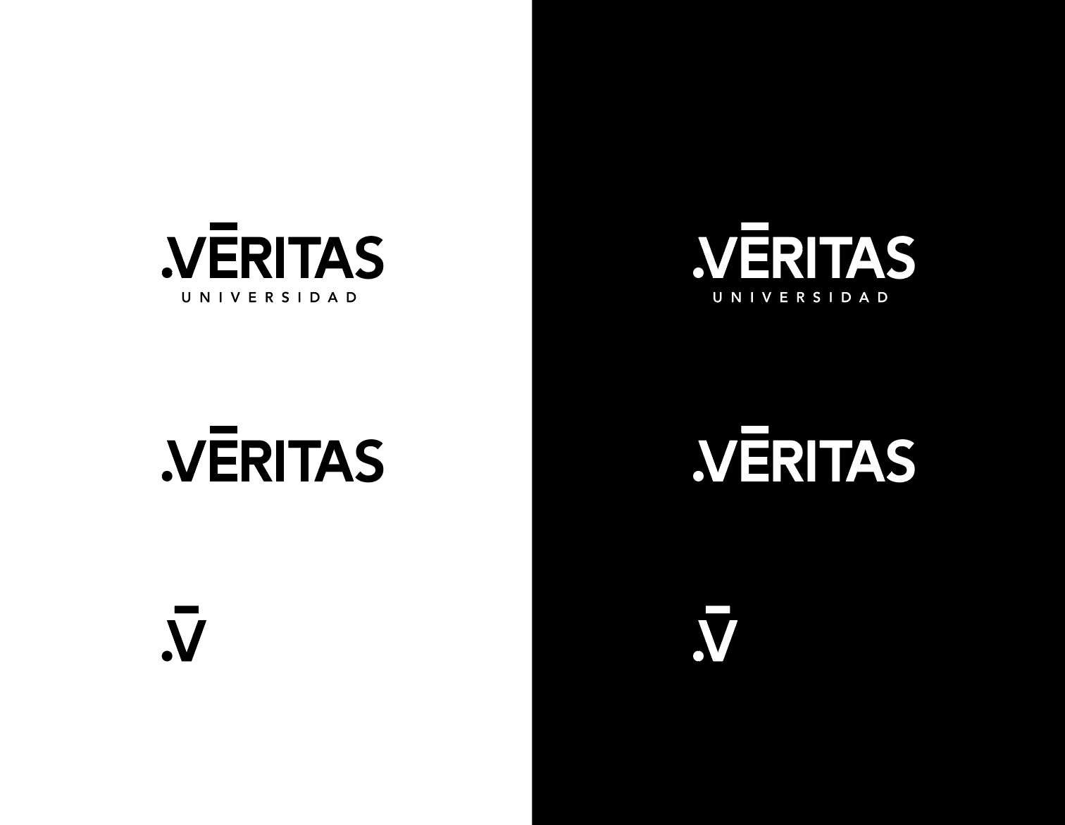
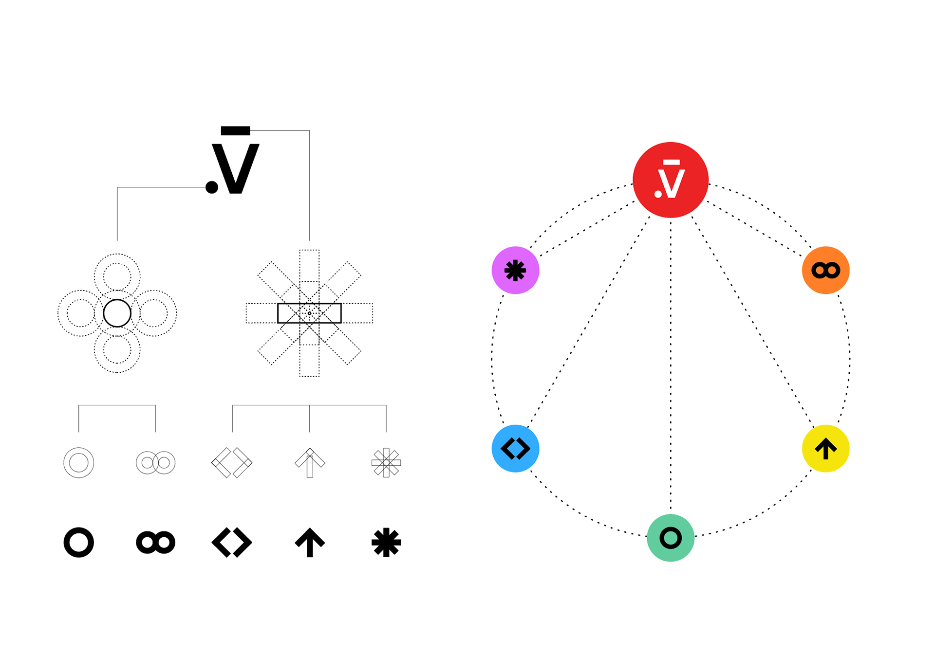
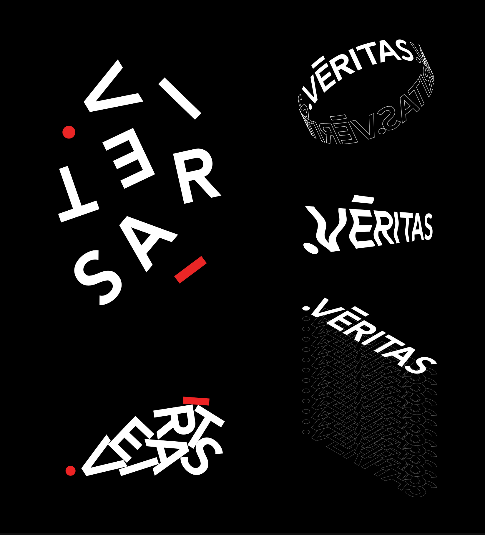
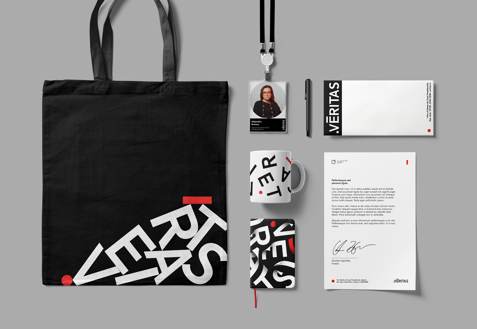
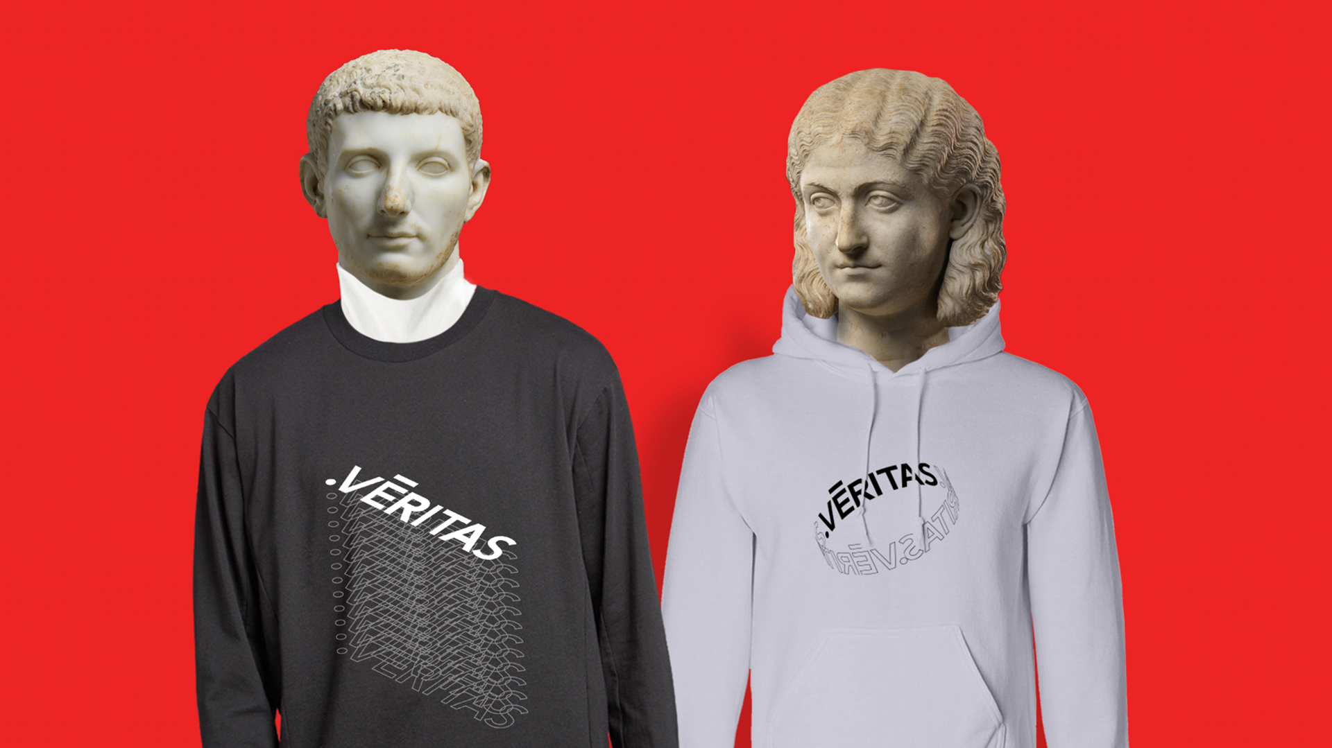
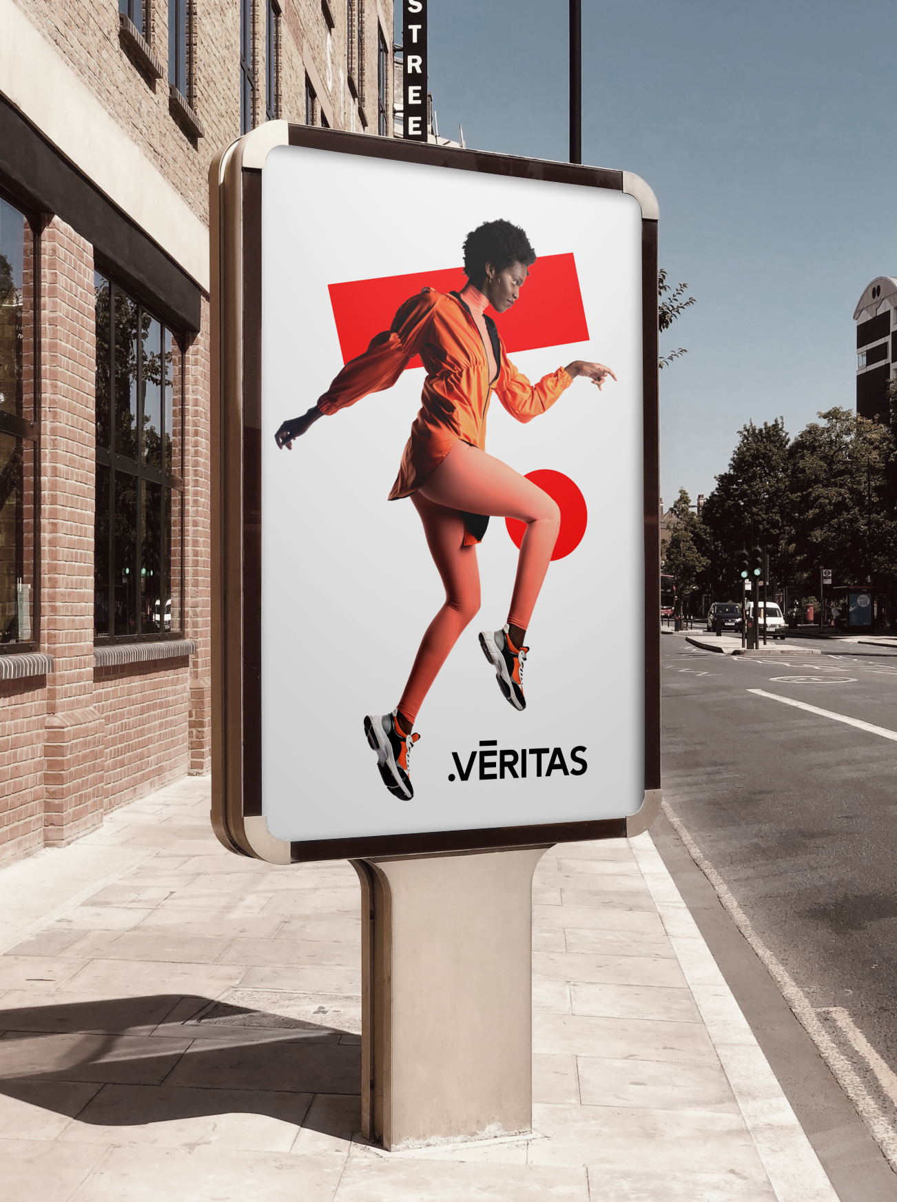
To reflect this new identity, we start by the visual hierarchy, proportions and kerning for the logotype so that we could improve its legibility and performance on small scales. Once the logotype gets fixed, we procede to create a flexible visual identity system based upon the dot and the macron which are the 2 most distinctive elements of our brand. The goal of this system is to reflect VERITAS’ creative and design thinking spirit. Besides these two elements, the redesign consists of a reconstruction of the brand architecture that creates an environment for all the existing and future business models to coexist and interact in a more cohesive way.
Creative and Art Direction: Rodrigo Ruiz
Graphic Design: Rodrigo Ruiz, Daniela Ochoa